Seasonal art direction & web design
Pressed + Flower
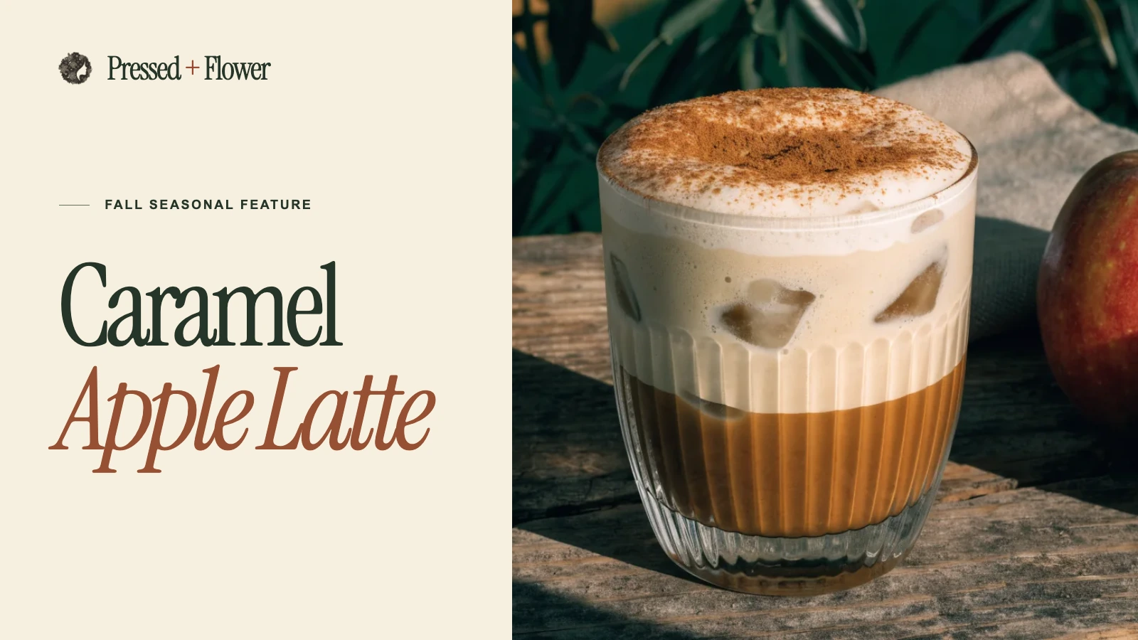
I built the café’s fall opening around one drink. “Caramel” sits in dark olive type, “Apple Latte” turns rust and italic, and a sunlit glass of iced coffee fills the other half of the page.
- Industry
- Food & beverage
- My contribution
- Seasonal art direction, responsive design and development
- Project status
- Independent seasonal website study
- Tools and methods
- Instrument Serif, DM Sans, HTML, CSS and JavaScript
Design process
Build a seasonal cover around one drink
The café’s floral mark and printed fall artwork set the palette. I designed the hero around an apple latte, then reworked the composition for someone opening the page on a phone.
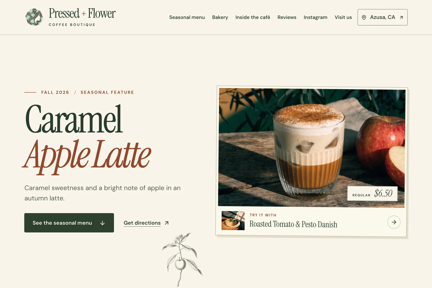
Pair the headline with the drink
The upright and italic lines of the drink name sit opposite an iced latte and apple. A price ticket anchors the image, and the small pastry pairing gives the eye a place to go next.
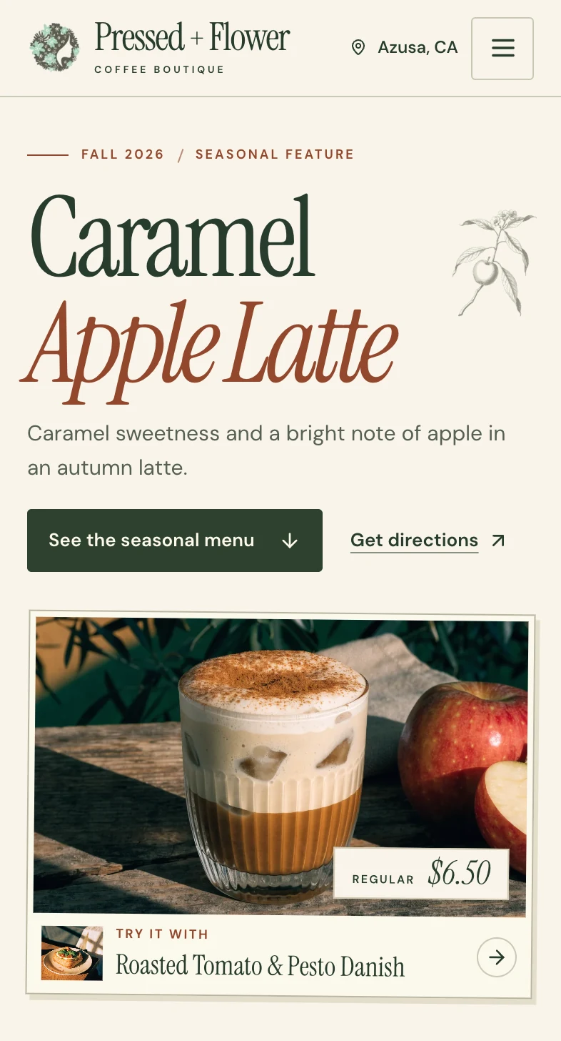
Stack the type and image for a phone
The headline, menu link and directions come before the framed drink. At 390 pixels wide, a visitor can see both actions without scrolling.
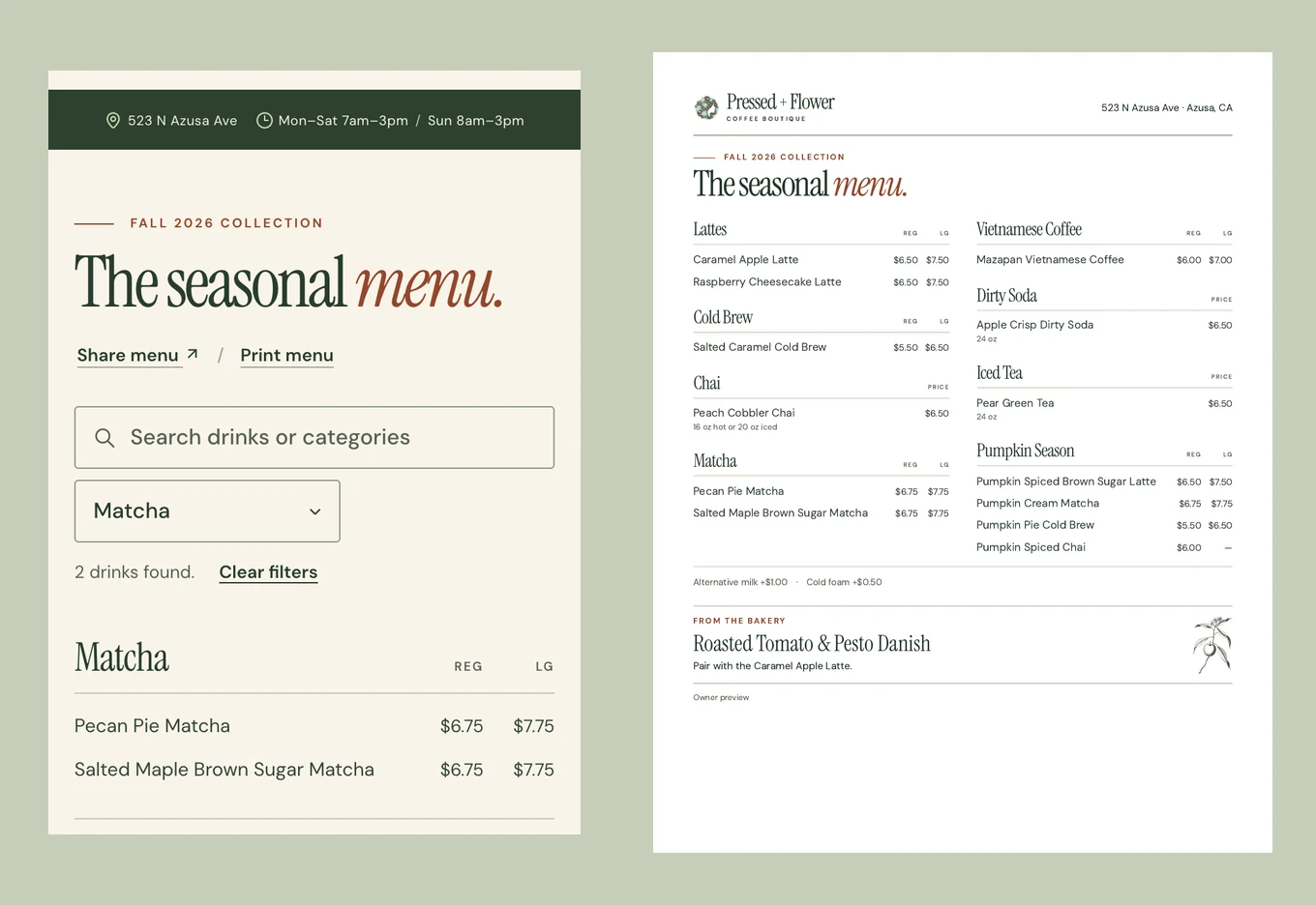
Follow the hero into the menu
The seasonal menu link opens the drink list. Here the phone is filtered to two matcha drinks, while the counter sheet uses the complete list.
The opening layout can be reused for the next featured drink, illustration and pairing. The phone and desktop versions use the same seasonal content.
Designing around the featured drink
Borrow the café’s printed palette
I carried the parchment and olive from the café’s printed artwork into the page, then used rust for the seasonal headline. A small apple illustration ties the typography to the drink.
Keep the price with the product
The regular price sits on a small paper ticket in the corner of the latte image. The pastry pairing sits just beneath it, like a suggestion from the counter.
Give the mobile hero a reading order
On a phone the drink name and the directions and menu links come first, followed by the drink image. Someone arriving from Instagram can decide whether to browse or visit within the opening screen.
The first screen on a phone
At 390 × 844 pixels, both actions fit within the first 401 pixels and the complete drink image remained visible. The layout also fit a 320-pixel-wide screen during review.