Architecture & interiors / Independent identity study
Northline
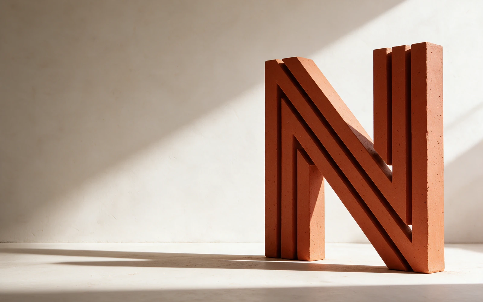
I drew an N from parallel beams, then tested the same spacing on an embossed folio, a wall and an editorial website.
The identity
A line you can build with.
The gaps between the strokes are as important as the strokes. Keeping them open lets the N work in a small project credit and as a raised sign.
Inter carries project names and material labels. Instrument Serif gives a short editorial line the warmth of a printed architecture folio.
- Terracotta#B6472D
- Graphite#202421
- Plaster#E9E5DE
From paper to plaster.
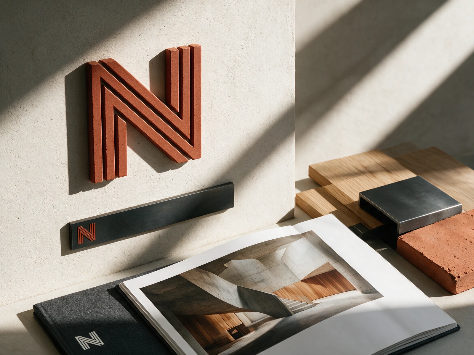
A blind emboss lets the N catch light. On the wall, the same shape gets its depth from the thickness of the material. The digital project page carries across the generous margin from the printed folio.