Beauty brand identity & landing page
Swayy
I wanted Swayy to feel like a beauty campaign from the first glance. A product still life, the folded S mark and a two-line headline introduce the idea of a collaboration before either audience opens the app.

- Violet
- Citron
- Ink
- Paper
Instrument Serif/Manrope
- Industry
- Beauty & wellness
- My contribution
- Visual identity, art direction and interaction design
- Project status
- Independent brand and marketplace prototype
- Tools and methods
- Figma, responsive web design, clickable prototypes
Design process
From a beauty campaign to a working marketplace
I started with a beauty still life and an invitation to collaborate. The September identity boards show how I built the visual system. The responsive campaign and the 19-screen prototype carry it from the first invitation to creator submission and brand approval.
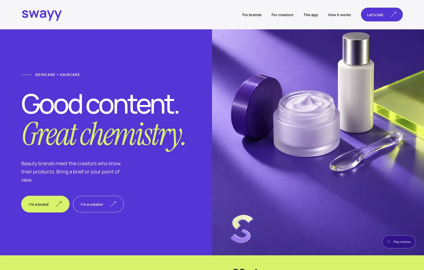
Frame Swayy as a beauty brand
A skincare still life gives the campaign its opening image. Violet unifies the frame, and the paired invitations lead brands and creators to their own workspace.
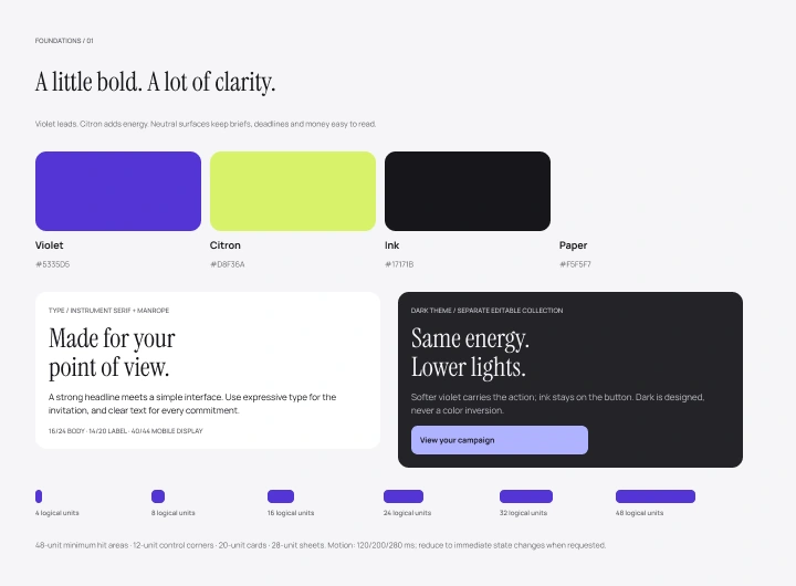
Set the visual language
I started with violet and citron, an editorial headline and a spacing scale that could serve both sides of the marketplace.
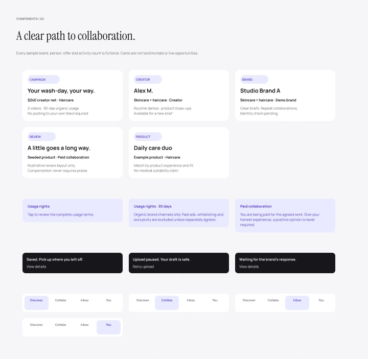
Decide what a card owes each person
The first component sheet sets out campaign cards, usage rights, status messages and separate navigation for creators and brands.
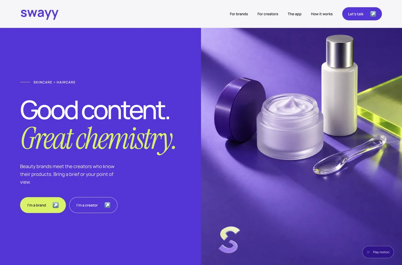
Give each audience a way in
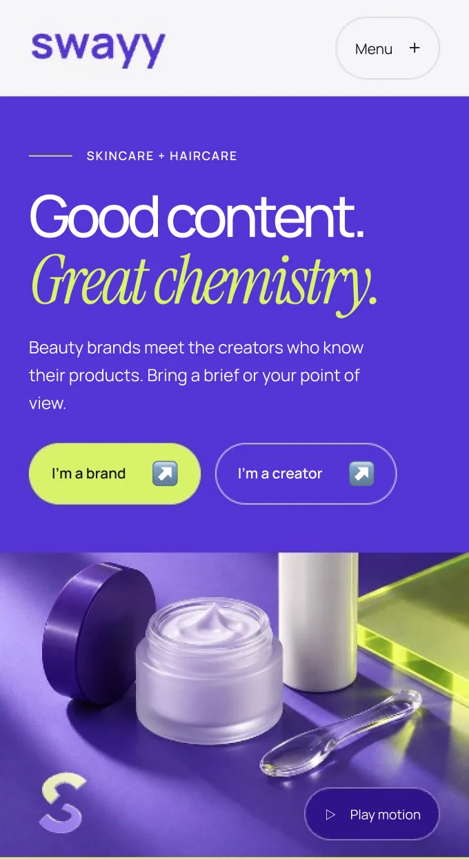
The violet introduction sits beside the beauty still life. A brand can bring a brief and a creator can find a campaign from the same opening.
Recompose the campaign for a phone
I stacked the two-line headline, audience actions and product image so the invitation stays readable at phone size.
Map when the next person takes over
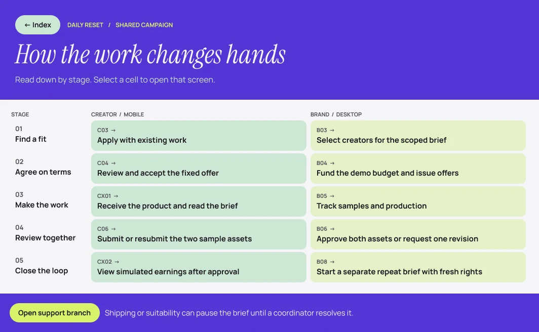
The two columns follow a brief through agreement, delivery, revision and reporting. Each row shows what the creator does and what the brand sees next.
Keep the brief beside the upload
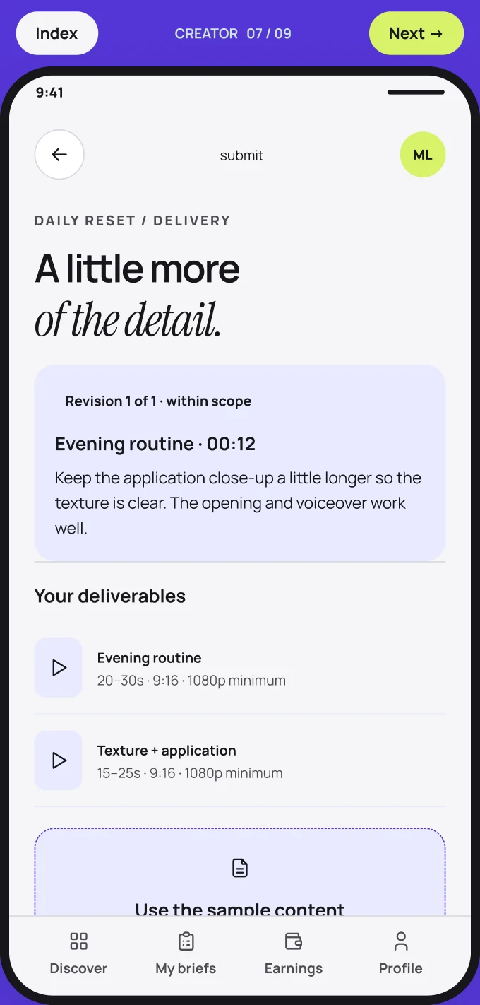
Creators can check the content request and deliverables while assembling a submission. The violet frame and persistent navigation connect this task to the rest of the creator app.
Put an active campaign in view
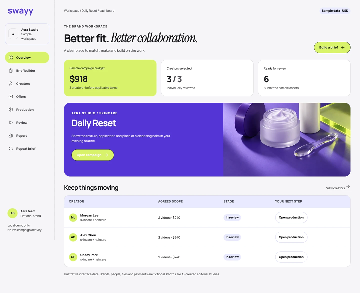
The brand dashboard opens with budget, campaigns and decisions to review. In the Daily Reset feature, the skincare image links the workspace back to the campaign.
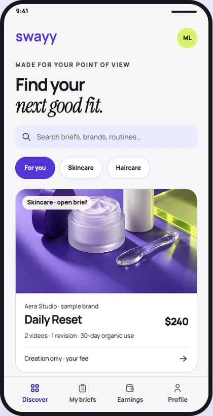
Browse opportunities on a phone
Skincare and haircare filters sit above the first campaign. A creator can see the fee and deliverables on the card before opening the brief.
The 19 editable prototype screens and the working web demo follow the same campaign from both sides. The responsive hero frames live in the original brand file.
Explore the landing pageOne identity, two invitations
Build the opening around the still life
The folded S mark and cosmetic packaging give the campaign a recognizable silhouette. Violet anchors the scene, while the citron accents pick out small details. The product imagery is illustrative.
Give each audience an entrance
“Good content. Great chemistry.” speaks to both sides of the collaboration. The two actions underneath let a visitor enter as a brand or a creator.
Carry the idea into the product
The original Figma boards set the palette, type and spacing. I used the subsequent prototype to work through what happens after a brief goes out, including submission, revision and approval.
From campaign to prototype
The responsive landing page leads into a working marketplace prototype. Its 19-screen Figma prototype shows how a creator and a brand move through the same campaign.